
Signlogic
Welcome to the branding presentation of Signlogic. Our brand represents innovation, clarity, and reliability in every solution we create
Typography – Poppins Bold
The Signlogic logo is built upon Poppins Bold, a geometric sans-serif typeface known for its clean lines and modern appearance. Its bold weight conveys strength and confidence, while its rounded shapes bring balance and approachability. This choice reflects the essence of our brand: innovative, reliable, and clear. By using Poppins Bold as the foundation, our identity achieves both professionalism and a contemporary visual appeal.

The Signlogic corporate palette combines vibrant yellows and oranges with solid gray tones. The warm colors express energy, creativity, and dynamism, while the neutral grays bring balance, strength, and professionalism. Together, this palette creates a modern and versatile identity that ensures consistency across all brand applications.

Logo Options
We have developed two logo variations for Signlogic, each designed to represent the brand’s values while offering a visual approach:
Option 1: A clean and structured design with a top frame, emphasizing clarity, stability, and professionalism.

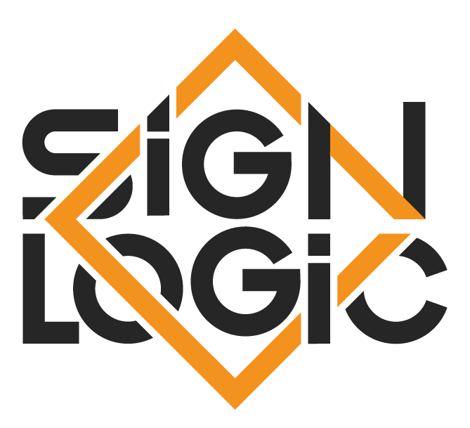
Option 2: A dynamic diamond-shaped frame, symbolizing innovation, energy, and forward-thinking.
Both options share the same typography and color palette to ensure consistency. These alternatives provide flexibility in style.